
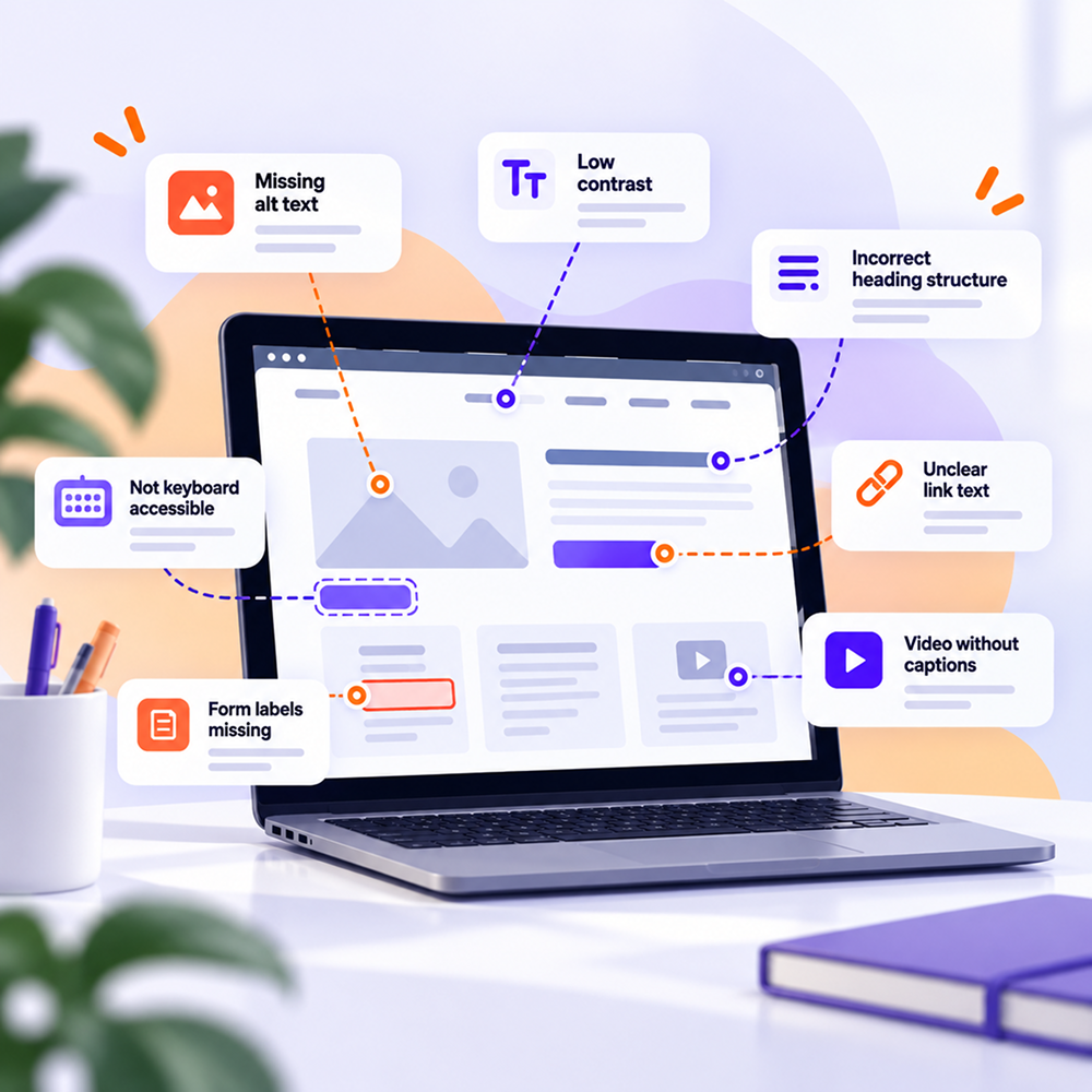
The Most Common Website Accessibility Issues and How to Identify Them
A website can work perfectly for the team managing it and still create serious difficulties for some users.
The problem is that many accessibility barriers aren't obvious when you navigate with a mouse, see the screen clearly, and use the website exactly as it was tested internally.
Change the situation slightly.
Try completing a purchase without a mouse. Use only the Tab key. Zoom the page to 200%. Look at a form and imagine that its field labels are being read by a screen reader.
The website starts to look different.
Here are some of the issues worth checking first.
Images without alternative text
A product image, diagram, icon, or banner may communicate information that a user cannot access if the image does not have an appropriate text alternative.
WCAG 2.2 requires text alternatives for non-text content when it conveys information or has a function. Purely decorative images are treated differently and can be ignored by assistive technologies.
A very common mistake happens here. A team checks whether the alt attribute exists and considers the issue resolved.
The quality of the text matters just as much.
If the image shows a product, the description should provide the information relevant to that product. If the image is a chart, simply saying "chart" does not help the user understand the data being presented.
How to check
Start with pages that contain many images. The homepage, product pages, blog articles, and landing pages are good places to begin.
The Wawsome Accessibility Checker can identify automatically detectable issues such as missing or inadequate image alt text.
For images that already have alt text, human review is still necessary.
Insufficient contrast
Light gray text on a white background may look subtle in a design. For someone with low vision, it can become difficult to read.
The problem often appears in secondary text, placeholders, buttons, menus, and elements in disabled or inactive states.
WCAG includes criteria for text contrast and for certain graphical elements and user interface components.
Contrast needs to be checked in the actual product. A design file may use the correct colors, while the final implementation can end up with different values.
How to check
Test colors for:
- Primary and secondary text
- Links and buttons
- Error messages and notifications
- Controls and interactive components
- Hover and focus states
- Charts or information conveyed through color
Don't limit testing to the homepage. Checkout and forms are often where poor contrast becomes much more costly for the user.
Forms without clear labels and instructions
Forms appear almost everywhere.
Account creation, quote requests, bill payments, appointment scheduling, and checkout processes all use fields where users need to enter information.
WCAG requires labels or instructions when user input is required. The goal is to make sure users understand what information they need to provide.
A placeholder should not automatically be treated as a replacement for a properly implemented label.
Then there are error messages.
"Invalid input" isn't very helpful.
Users need to understand what went wrong and what they need to correct. In a long form, clearly identifying the problematic field matters even more.
How to check
Choose a complete user flow and go through it from beginning to end.
It could be:
- Contact form
- Account creation
- Checkout
- Online appointment booking
- Quote request
- Login
- Password reset
- Bill payment
Check whether every field has a clear label and whether error messages can be understood without relying exclusively on color.
For important forms, keyboard and screen reader testing can provide information that a scanner cannot fully capture.
Navigation that doesn't work with a keyboard
Try a simple test.
Put the mouse aside and press Tab.
Can you reach the menu? Can you open submenus? Can you select a product? Can you complete the form? Can you submit it?
WCAG includes requirements for keyboard accessibility and avoiding situations where focus becomes trapped inside a component.
The problem often appears in custom components.
Dropdowns, modals, carousels, date pickers, and JavaScript-based menus may work perfectly with a mouse while behaving poorly with a keyboard.
How to check
Use Tab to move forward and Shift + Tab to move backward.
Follow the visual focus indicator. You should always be able to see where you are on the page.
Test interactive components using Enter, Space, and arrow keys where the component's behavior requires them.
Perform the test on the flows that matter most to the business. Login, checkout, appointment booking, and important forms should be checked first.
Buttons and links without accessible names
A magnifying-glass icon is easy to recognize visually as "Search."
For assistive technology, the icon needs the necessary programmatic information so that its function can be communicated to the user.
WCAG addresses the name, role, and value of user interface components. A control without an accessible name can be very difficult to use with assistive technologies.
The issue commonly appears with:
- Icon-only buttons
- Mobile menus
- Close buttons
- Video controls
- Carousel elements
- Social sharing buttons
- Custom components
- Links with vague text such as "click here"
An accessible name should communicate the purpose of the element.
How to check
You can start with the Wawsome Accessibility Checker for automatically detectable issues.
For important components, also use your browser's accessibility inspector or test the page with a screen reader.
If the user hears "button" without learning what the button does, the implementation should be reviewed.
Incorrect heading structure
Headings are sometimes used purely for visual appearance.
A piece of text gets an H2 because the size looks right. Another becomes an H4 because it fits the layout. Over time, the semantic structure gets lost.
For screen reader users, headings can be an effective way to navigate through a page.
A long page containing articles, legal terms, services, or products becomes much easier to navigate when its heading structure is logical.
How to check
Look at the page outline.
The main heading should clearly indicate the subject. Important sections should be organized into a logical hierarchy.
Don't choose a heading level based on the visual size you want. Visual appearance can be controlled with CSS. Semantics should describe the structure of the content.
Documents and downloadable files
A website may have well-structured pages and still provide an inaccessible PDF exactly when a user reaches the information they need.
This is common in the public sector, banking, insurance, education, and healthcare.
Documents can contain:
- Scanned images without available text
- Incorrect structure
- Difficult-to-complete PDF forms
- Charts without alternatives
- Incorrect reading order
- Poorly described links
- Tables that are difficult to interpret
If a document is part of the service provided to the user, its accessibility should be assessed.
Video content without captions
Video is increasingly used for product presentations, tutorials, educational content, and social media communication.
If information is communicated through speech, users who cannot hear the content need an appropriate alternative.
Captions should accurately reflect the spoken information. Automatic transcription can help with production, but the result should be reviewed before publication.
If a video contains important information exclusively through visual content, an appropriate description of the visual information may also be necessary.
Why doesn't a scanner find everything?
Automated scanning is extremely useful. For large websites, it can save significant time and surface recurring issues.
The Wawsome Accessibility Checker can identify many automatically detectable WCAG issues, including missing alt text, contrast failures, missing form labels, incorrect heading structures, and certain keyboard or interactive-element issues.
A tool can detect that an alt attribute exists.
It cannot determine with certainty whether that text actually explains the image in the context of the page.
It can detect certain structural issues.
It cannot fully reproduce the experience of a user trying to complete a complex process with a screen reader.
That's why a useful accessibility assessment combines multiple types of evaluation.
Start with the flows that matter
If your website has 5,000 pages, manually checking every element can quickly become difficult to manage.
Start with the essential user journeys.
For eCommerce, check the product page, cart, and checkout.
For banking, check login, transactions, and the main services used by customers.
For healthcare, look at appointment booking, forms, the patient account, and access to information.
For the public sector, check document submission, forms, payments, and access to information citizens need.
Then expand the assessment to the rest of the website.
User impact should influence the order in which issues are remediated.
How can monitoring help?
Let's say you've completed an assessment and the team has fixed the priority issues.
Two weeks later, a new landing page is published. Marketing uploads new images. Development changes the main form. Another 50 products are added.
The website has changed.
The Wawsome Accessibility Monitor can continuously monitor your website and re-scan pages when updates are detected, helping identify detectable issues introduced by new content or components.
For a frequently updated website, accessibility checks should become part of the normal website management process.
What do you do with the issues you find?
A long report can create the impression that every issue needs to be fixed in the same order.
In practice, prioritization helps.
Sometimes we forget to ask a simple question: what prevents the user from completing their task?
An issue on the checkout deserves immediate attention if it prevents a customer from completing an order.
An inaccessible button in an appointment flow can prevent a patient from selecting an appointment.
An authentication issue can make an entire account unusable for a particular user.
After impact, you can look at how frequently the issue occurs and how many pages are affected.
This is where the report starts becoming useful to the development team. Issues become concrete tasks that can be included in remediation sprints.
How Wawsome can help
If you haven't assessed your website yet, an initial scan is a practical first step.
The Wawsome Accessibility Checker can identify automatically detectable issues and provide an initial picture of the areas that require attention.
After scanning, the results can be complemented with manual checks for criteria that require human evaluation.
Websites that change frequently can use the Wawsome Accessibility Monitor to track issues introduced later.
For features provided directly to users, you can also explore the Wawsome Accessibility Widget.
You can also explore the complete range of Wawsome accessibility features.
FAQ
How can I check whether my website has accessibility issues?
You can start with an automated scanner for issues that can be detected programmatically. Continue with manual testing of important user flows and keyboard or assistive technology testing where necessary.
Can a score tell me whether my website is accessible?
A score provides an overview of the criteria evaluated by the tool. Automated tools cannot determine the complete accessibility of a website on their own.
What accessibility issues can I identify myself without technical knowledge?
You can perform some simple checks. Try navigating with a keyboard, zoom the page, check whether forms have clear labels, and look at text contrast. For technical criteria, you'll need appropriate tools and people familiar with WCAG.
Why do I need to check my website again after remediation?
Websites change. A new landing page, form, or component can introduce new barriers. Monitoring and retesting are useful after relevant changes.
How should I prioritize the issues I find?
Start with barriers that prevent users from completing important actions. Checkout, authentication, appointments, forms, and payments can have a direct impact on users. After that, you can organize the remaining issues by severity and how widely they appear across the website.
A good place to start
Accessibility becomes much easier to manage when you can see the concrete issues affecting your own website.
Scan the important pages, check the flows users need to be able to complete, and determine which barriers should be addressed first.
A scanner helps identify automatically detectable issues. Manual testing completes the picture where context and human evaluation are required.
From there, you already have something useful for the team: real issues, affected pages, and a clear starting point for remediation.